MA Dissertation
University and personal project
This project is a redesign of my Master’s Degree Dissertation. The original was a fairly bland A4 document with little personality, purely just the information. I wanted to create a version that was a more enjoyable read. While working on this I had just finished reading Jost Hochuli’s ‘Detail in Typography’, a beautiful little book. The design for my essay was taken from Hochuli’s work as an exersice to understannd his methods. I love the simple use of black and red, Futura and Minion. All the spacing is regular and in places, slightly unusual. By accurately measuring the typography and layout I could understand the original specification enough to recreate it as a template in InDesign.
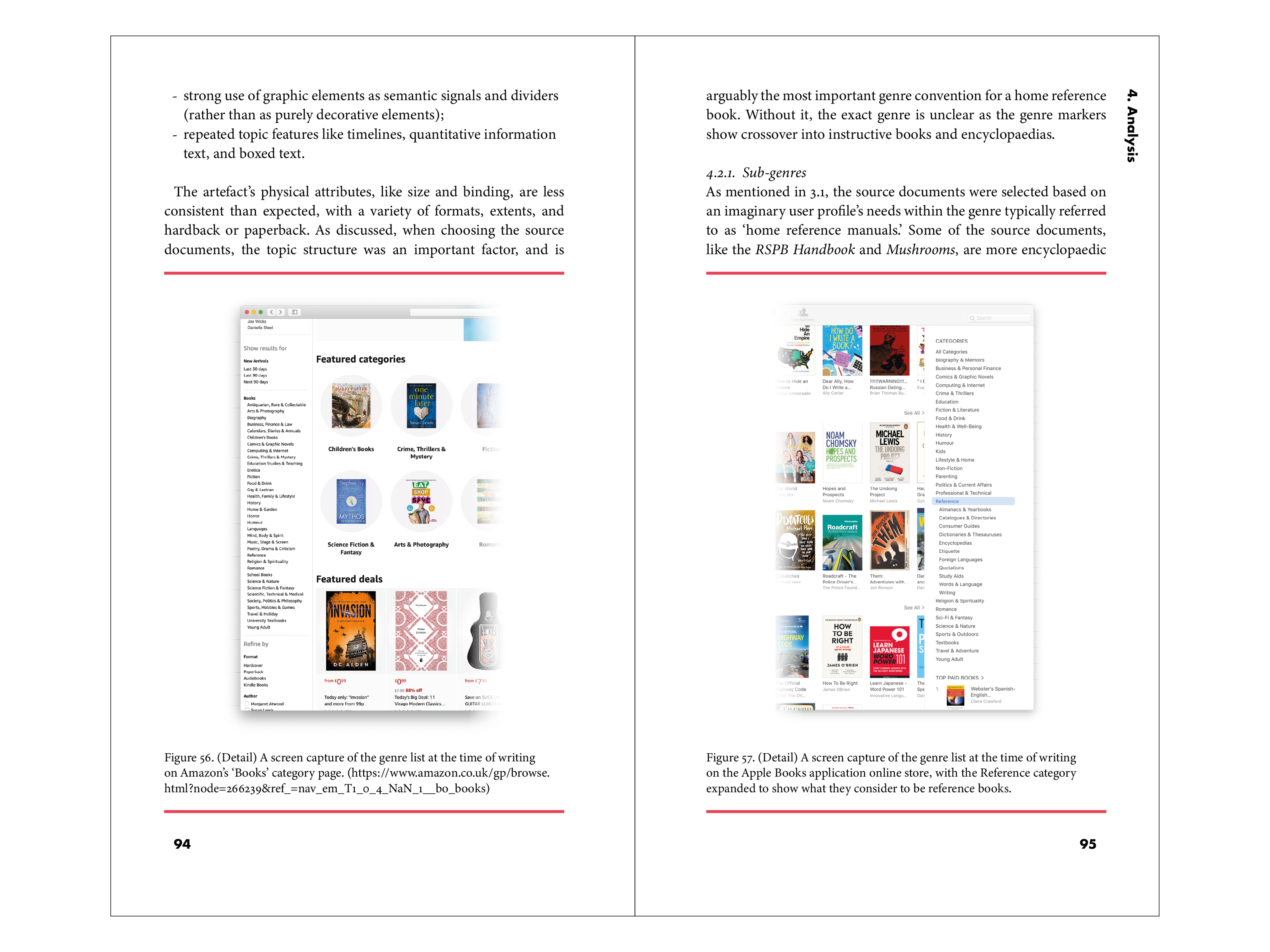
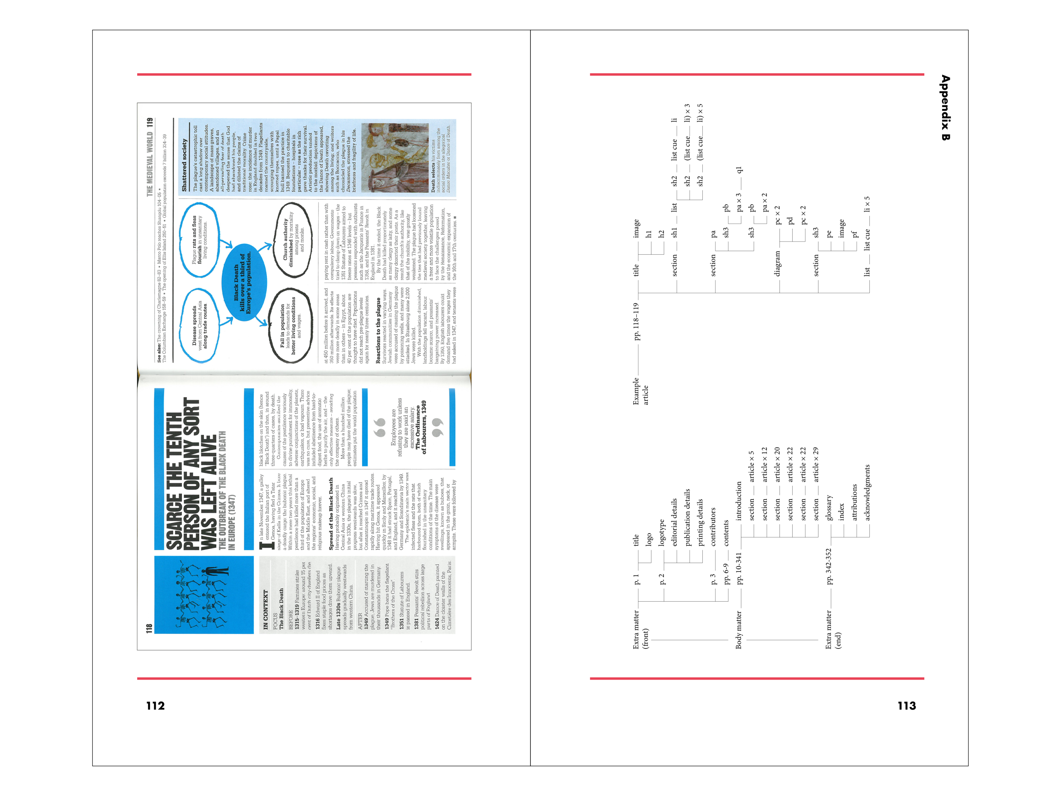
The dissertation itself is an analysis into the graphic translation of multimodal documents across print and digital systems. Put simply, using six example documents, how effectively can reference books be created as both printed books and digital books for viewing on tablet computers? It discusses the methods for analysis, the analysis of the example documents, and finally what can be gleaned from this information.
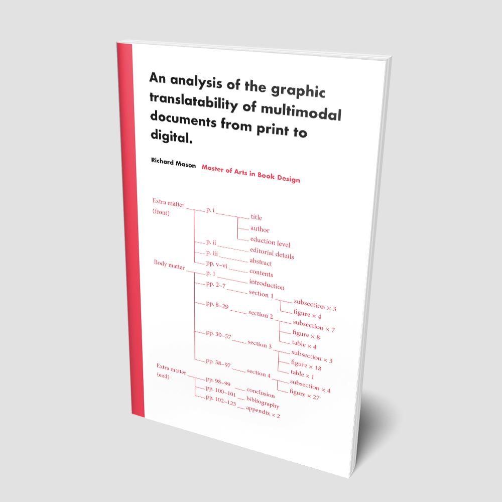
The cover design is a ‘modified tree diagram’ (discussed in the essay) of the printed essay itself as an interesting visual reference to a potentially quite dry area of research.
If you would like to know more or read the dissertation in full please contact me and I will happily send you a digital copy.
I hope to soon have a phyiscal printed version of the dissertation to use and display here.
- Size | 125 x 210mm
- Typeface | Minion with Futura display