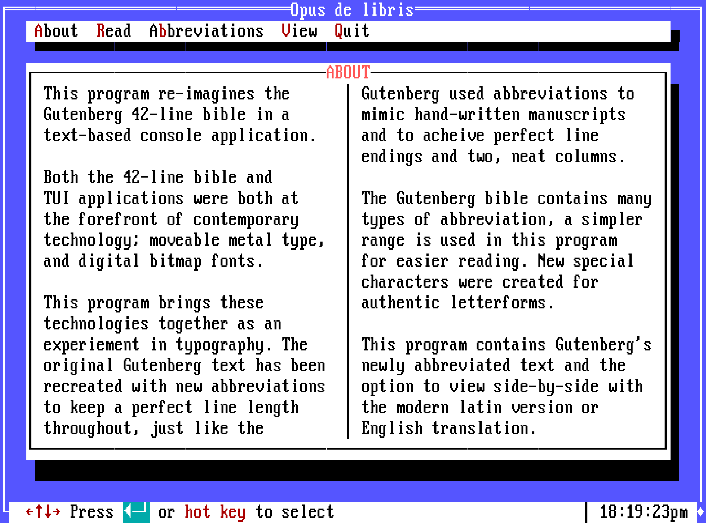
The Gutenberg BIOS
Personal project
Continuing on from my box drawing characters experiments on the London Tube Map I wanted to try my hand at designing a BIOS style ‘programme’.
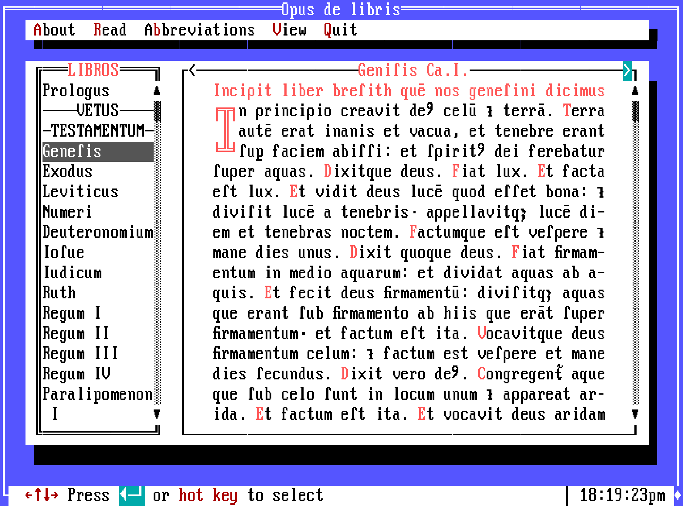
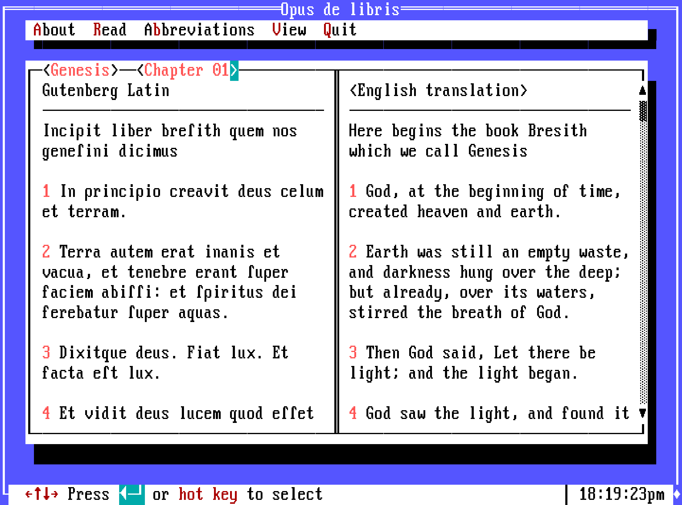
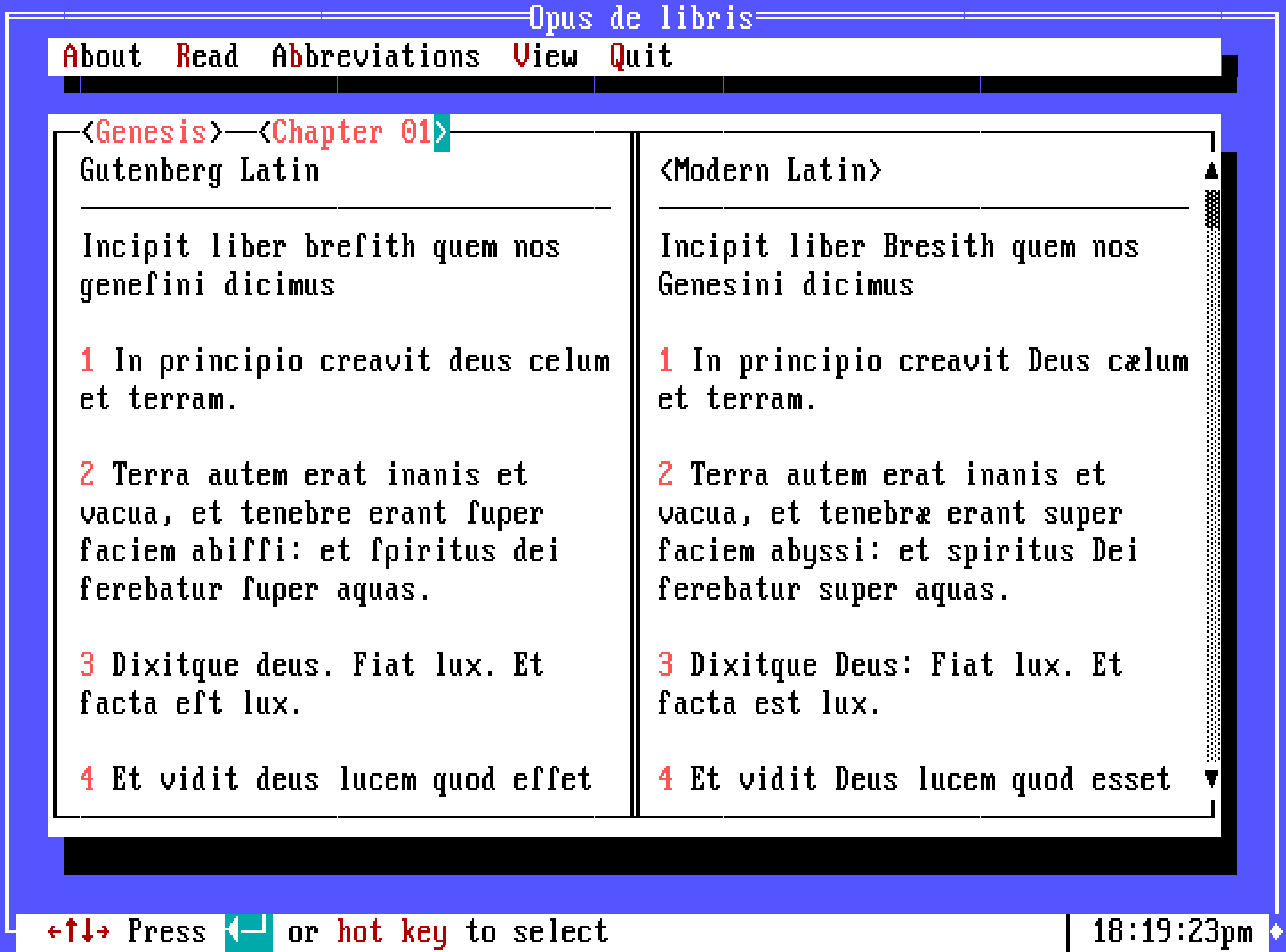
In short, I picked the Gutenberg Bible to adapt because both BIOS text mode and Gutenberg’s book were at the very start of their contemporary typographic technologies; printed moveable type and digital fonts and documents. I thought it would be fun to draw a comparison between them by combining the two into one document.
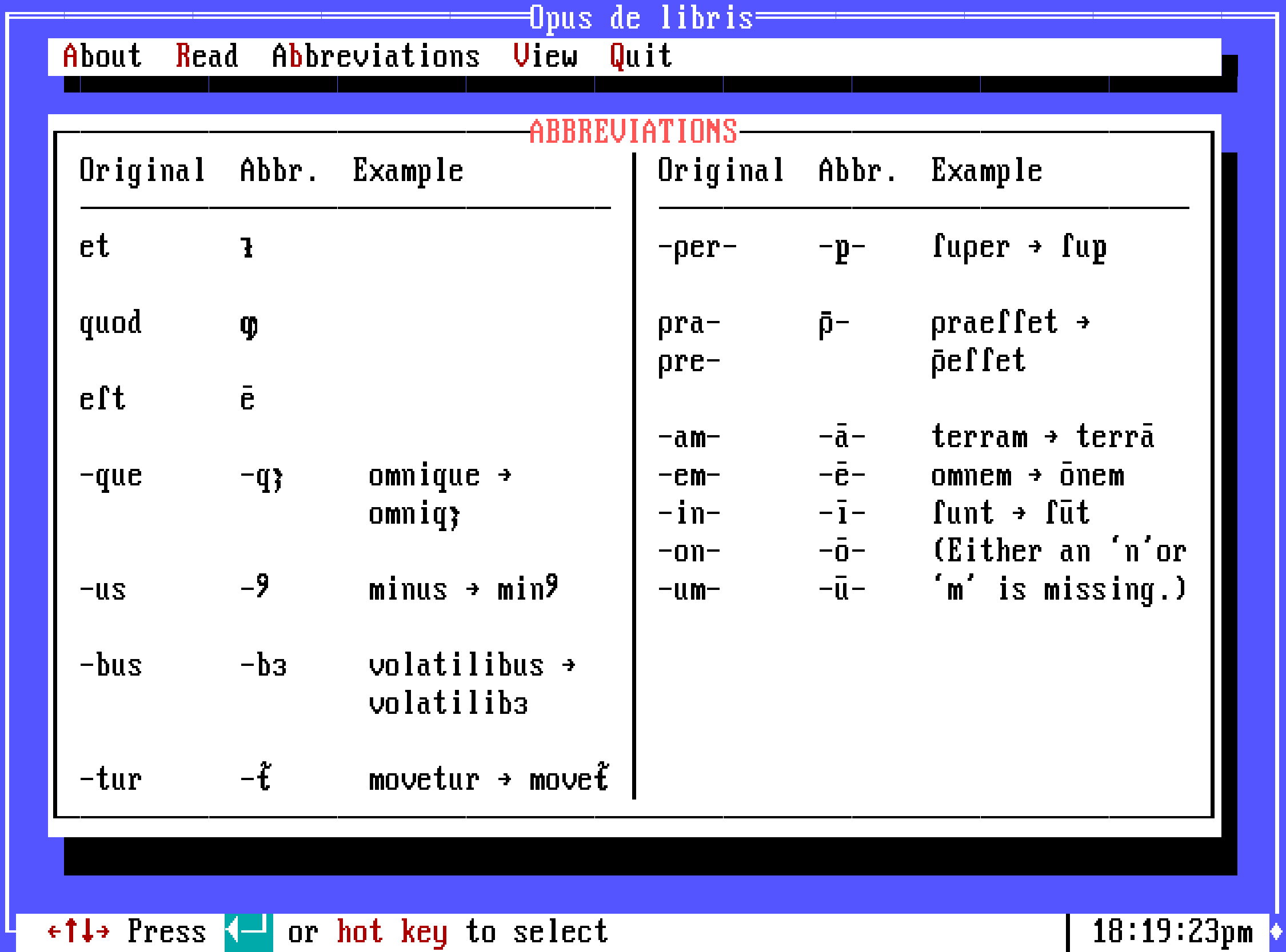
The most important part of this project was the font. An authentic font that replicates the IBM PS/2 VGA font was used, created by and available at The Ultimate Oldschool PC Font Pack. Their version uses the characters from code page 437 and includes an extended unicode character set. This gave me nearly enough characters to cover all of Gutenberg’s strange scribal abbreviations, but for a few I had to create my own; image seven explains these irregular letterforms.
The programme is designed to be entirely navigable using the highlighted keyboard characters and buttons showing what the user can interact with.
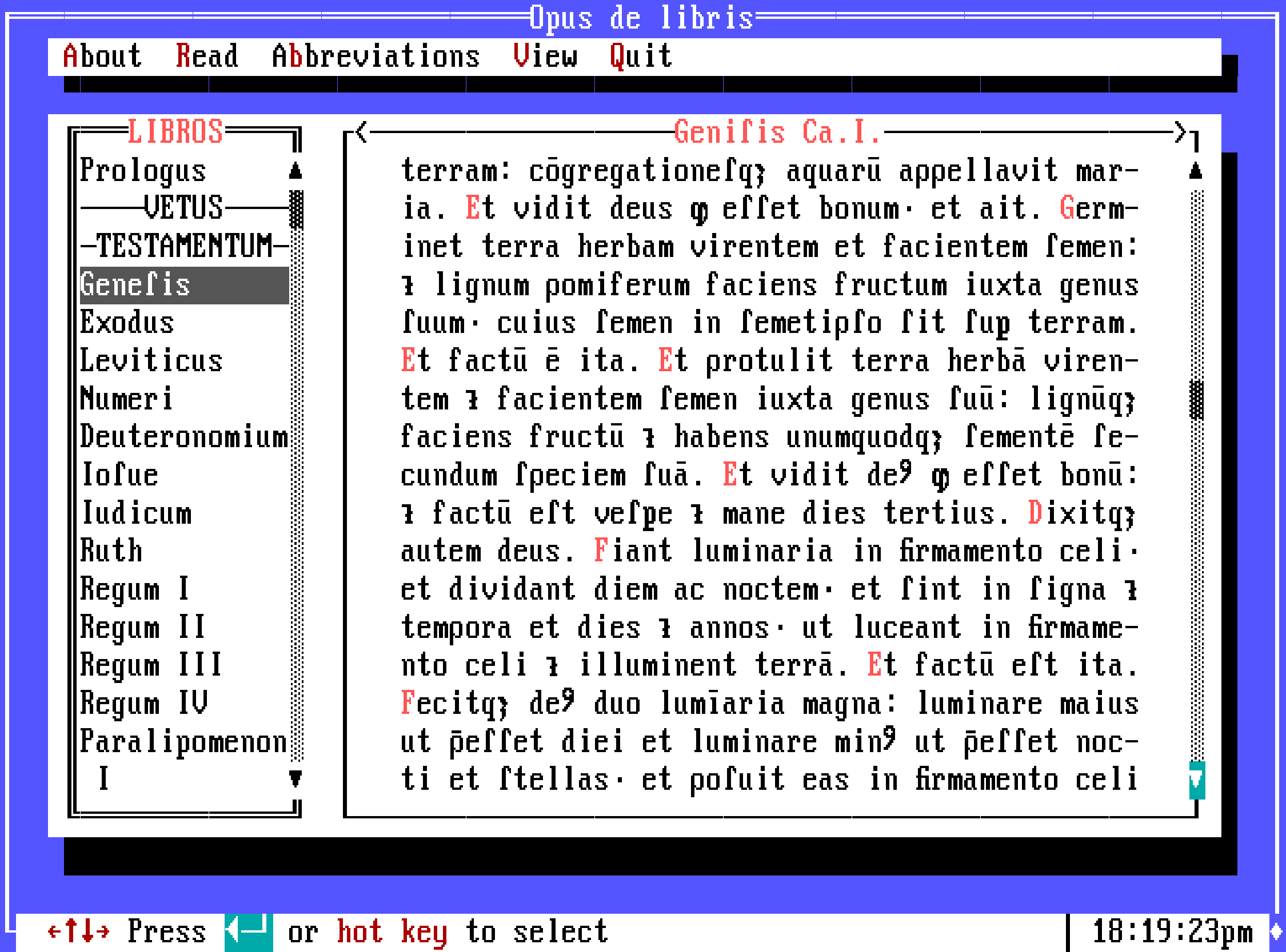
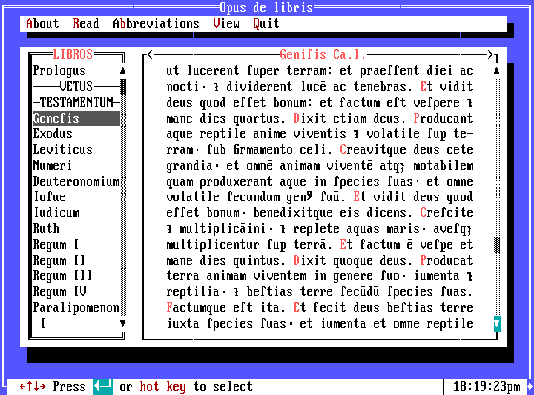
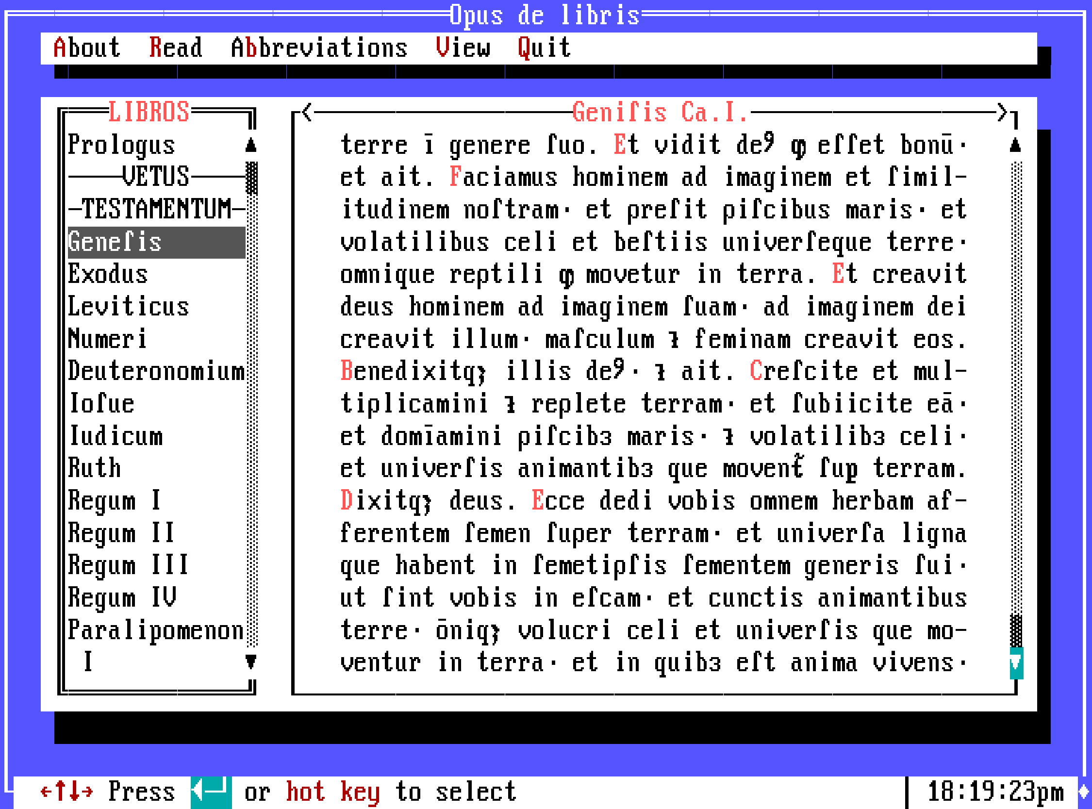
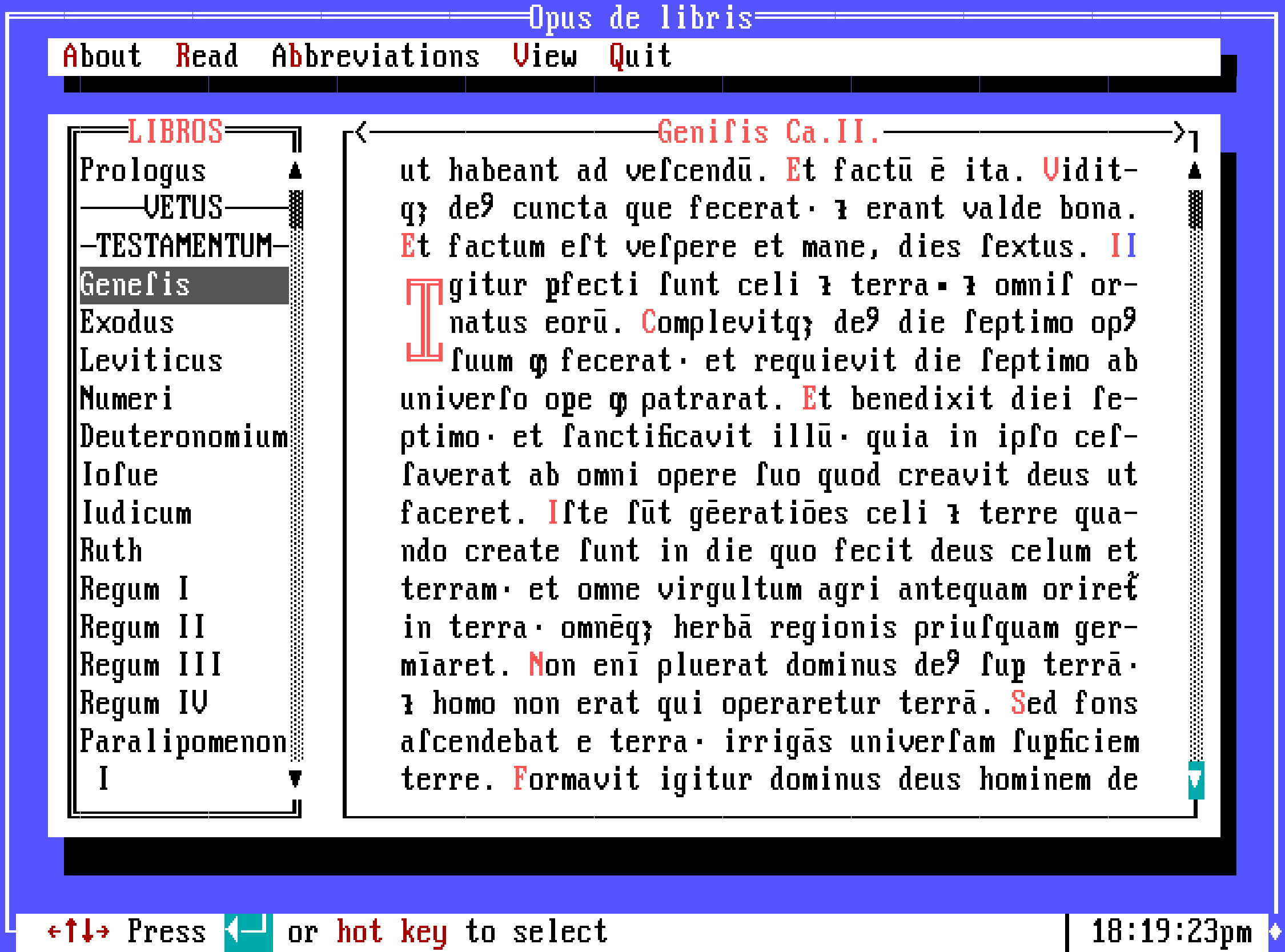
Gutenberg’s source text has been re-abbreviated to fit exactly into the 46 character column without any longer or shorter lines. I took the base latin text and, by reading Gutenberg’s bible (viewed on Keio University Library) to understand his use of abbreviations, I applied new styling to ensure the exact line length.
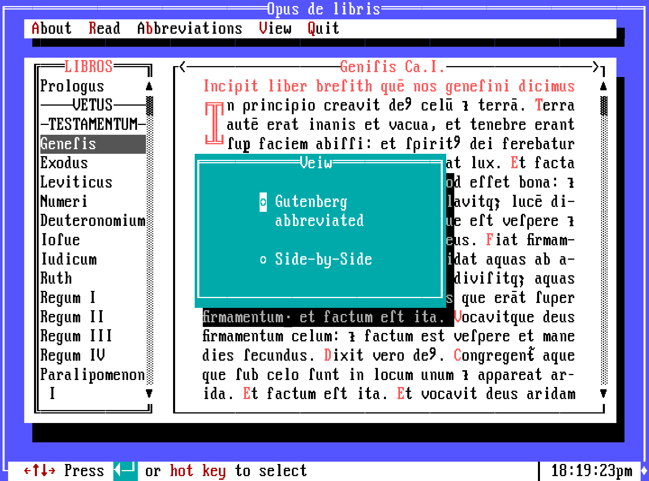
I wanted to include the translated versions to allow the user to actualy read the text. The space-efficient way was to view them in a side-by-side mode; the user can select either the modern Latin or English translation.
- Size | 720 x 400px (actual size 540 x 400px)
- Typeface | AcPlus IBM VGA 9x16